Charlotte Beauchamp, former head of ILO Publishing Unit
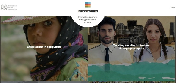
If you ever struggled trying to explain to your friends and family what are labour standards and collective bargaining , you know sometimes is hard to express these concepts with accessible and simple language. However, this challenge inspired the former head of the Publishing unit, Charlotte Beauchamp, to create InfoStories, a digital magazine about the world of work.
InfoStories was first launched as an iPad app in 2014, the first of its kind for the ILO. The project has been presented in the Frankfurt Book Fair and the app has been downloaded in dozens of countries around the world. This month, InfoStories launched its online version at ilo.org/infostories, acessible on any device.
We talked to Ms. Beauchamp about the creation of InfoStories and how the project evolved over time.
What inspired you to create InfoStories?
Some world of work issues grab at your heart strings. You can’t be unmoved by stories of women trafficked into prostitution or children working in open-cast mines. But how do you advocate for less “sexy” work issues, like the right to join a union or the right to collective bargaining? There are so many important topics that the ILO works on that need to be better understood – without sensationalizing them. So we set ourselves the challenge to take some of these topics and explain them visually. And rather than taking a traditional journalistic angle, we decided on an infographic approach – editing down quite complex information and retelling it with more images than words – and to make a product that would be purely digital.
How has InfoStories been different from other digital projects you have been involved with?
When you’re putting together a book in a digital format like EPUB you test and test your product, but you’re testing for technical errors. With InfoStories we tested again and again too, but with a very different goal: we wanted to understand whether the content made sense and had an impact and whether the interactive journey we’d created was intuitive. We showed prototypes to real users, watching and noting their behaviour and listening to their comments, then we adjusted the content in response. Sometimes the adjustments were small, moving an icon or changing the position of a label; sometimes we had to commission whole new features. When you’re creating something interactive, the user’s experience is paramount. It’s quite humbling to see your brilliant design ideas trashed, but you understand very quickly that if it doesn’t make sense to the user then it’s got to go.
What were the most challenging aspects of the project?
A creative project is by its nature unpredictable and you have to be open to exploring new ideas as they come up; at the same time my job was to keep everything on schedule and within budget. On top of that we were experimenting with a different storytelling format in a new medium. Add to that a big bureaucracy with its own constraints … I think that’s what they call “creative tension”!
How do you feel about how InfoStories has evolved up until now?
The first edition of InfoStories was an iPad app and now it’s being launched as a website, making the same content available to a much bigger audience. At first I was worried that we’d lose the immersive, tactile experience of the iPad, but that’s not been the case. The designers have worked really hard to keep the feeling of exploring a distinct visual world in each issue, and of course it’s available on your mobile phone so there’ll still be lots of tapping and swiping.
I’m really curious to see how users will react to the online version, what they share and comment on, and what issues they’d like us to cover next. The app has been popular in Asia and I’m interested to see if we’ll get traction in different parts of the world.
How has InfoStories been received so far?
We’ve had lots of great feedback on the app but the biggest mark of success has come from my colleagues who’ve been using InfoStories at meetings, particularly when they travel around the world. They tell us they choose it because of the simplicity of the message and its visual impact, but also because they like the image it projects of the ILO. That’s a good feeling, knowing that we’ve made something that my colleagues are proud to identify with!

